Little's Law
19 Jun 2018Every factory I’ve ever worked at or been to has had one thing in common: the perception that there wasn’t enough space. I say perception because this is really more of a perspective than a statement of fact. The average workstation is generally cluttered with all sorts of things that aren’t needed for the process. A fix for this is generally 5S (which I would recommend as a great first pass), but the engineers among us will desire a more scientific approach to de-cluttering the workstation.
The answer to this is a little-known (no pun intended) theorem called Little’s Law. This theorem, thought-up by John Little, originally modeled the long-term average number \(L\) of customers in a stationary system, stating it is equal to the long-term average effective arrival rate \(\lambda\) multiplied by the average time \(W\) that a customer spends in the system. This can be expressed as 1:
\[L=\lambda W\]Little’s Law is also a general term for any sort of formula or theorem taking on the form \(Y=XZ\). Since we aren’t looking at queuing theory, Little’s Law in the manufacturing context is where \(\text{WIP}\) is work in process, \(\text{TH}\) is throughput, and \(\text{CT}\) is the average cycle time. Some quick thought experiments can validate this theory. Holding \(\text{TH}\) constant, if \(\text{CT}\) increases, we expect \(\text{WIP}\) to increase as well. Leveraging this, we can begin to model ideal scenarios given actual process information. In today’s post, we will focus on the relationship between \(\text{TH}\) and \(\text{WIP}\), although \(\text{CT}\) can be modeled in the same fashion2.
\[\text{WIP} = \text{TH} \times \text{CT}\]I’ll start off with the Python code and then we can move into R. It takes about the same amount of code with either, so choose the language you are most comfortable in.
import pandas as pd
import numpy as np
import matplotlib
import matplotlib.pyplot as plt
Now, let’s generate a random process. In this case, we want 6 steps, each with a random process time of between 1-100 seconds. Alternatively, you can comment out the random chunk of code and put in your own times.
np.random.seed(1234) # set seed
process = np.random.randint(101, size=(1, 6))
# process = [18,59,30,21,78,10]
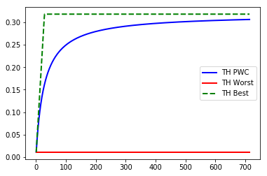
Upon execution, our random process gives us array([[47, 83, 38, 53, 76, 24]]). Now we need to define some variables. Before we start, we have four that are part of the formulae and one that will be used to figure out a range of WIP levels to use. More details can be found about the following formulas in Factory Physics2. The first variable is \(T_0\), which is the raw cycle time for the entire process. Next is \(r_b\), which is the bottleneck rate, or the slowest process divided by \(T_0\). Next is our critical WIP level, \(W_0\). This is the WIP level at which a line, with no variability in process times, that achieves maximum throughput \(r_b\) with minimum cycle time \(T_0\). The formula is \(W_0=r_bT_0\). Then we have our worst-case throughput, or \(TH_w\). This is a constant and is defined as \(\frac{1}{T_0}\). The last variable is the max range of WIP we want to model. Because our \(TH_{pwc}\) never converges with \(TH_b\), we will go with 25 times \(W_0\), which will give us room to fit most real-life scenarios and context for the full chart.
# define variables
T0 = np.amax(process)
rb = np.amax(process)/np.sum(process)
w0 = rb*T0
THw = 1/T0
maxw = int(w0*25)
After setting up our variables, we can initialize our arrays. We will want to draw three different lines in a single chart to model \(\text{TH}\) in three different ways: best case (full bottleneck speed), worst case \(1/T_0\), and the practical worse case, which gives us a threshold that should generalize to reality where the line between good and bad is.
# setup arrays for each line in the plot
wip =[] # WIP levels
THpwc =[] # practical worst case throughput
THw =[] # worst case throughput
THb = [] # best case throughput
The last step before the results is to iteratively calculate the throughput values. Python and R (or any other language for that matter) can handle this task much more elegantly than say, Microsoft Excel because we can store our results as arrays and simply graph them in a single chart. With this step, we introduce three new formulas2.
\[\text{TH}_{pwc}=\frac{w}{w_0+w-1}r_b\] \[\text{TH}_{w}=\frac{1}{T_0}\] \[\text{TH}_{b}=\begin{cases} \frac{w}{T_0} & w \leq W_0\\ r_b & w > W_0 \end{cases}\]# loop through our formulas and fill the arrays
for i in range(1,maxw):
wip = np.append(wip, [i], axis=0)
pwc = i/(w0+i-1)*rb
THpwc = np.append(THpwc, [pwc], axis=0)
worst = 1/T0
THw = np.append(THw, [worst], axis=0)
if i<w0:
best = i/T0
else:
best = rb
THb = np.append(THb, [best], axis=0)
This final step will fill our arrays so we can build our chart.
# plot our results
plt.plot(wip, THpwc, marker='', color='blue', linewidth=2, label="TH PWC")
plt.plot(wip, THw, marker='', color='red', linewidth=2, label="TH Worst")
plt.plot(wip, THb, marker='', color='green', linewidth=2, linestyle='dashed', label="TH Best")
plt.legend()
plt.show()
And there we have it. Above the blue curve is the good scenario, where below is bad. Obviously, you want to minimize WIP levels, but this chart can be used to determine a threshold for where “good enough” is. I have plotted the actual WIP level on the chart and highlighted the “good” region in the past to easily show technicians and managers an assessment of the target and future state. Use this chart to figure out ideal WIP levels and de-clutter your workstations.
For Jupyter notebooks as well as raw code for both python and R solutions, visit my repository.
For the R code, see below:
set.seed(1234)
process <- sample(1:100, 6, replace=T) # generate random process with 6 steps with times between 1-100 units time
# process <- c(18,59,30,21,78,10) # <- alternatively fill in your own process times

# define variables
T0 = max(process)
rb = max(process)/sum(process)
w0 = ceiling(rb*T0) # round to the nearest whole number
THw = 1/T0
maxw = w0*25

# setup arrays for each line in the plot
wip <- vector() # WIP levels
THpwc <- vector() # practical worst case throughput
THw <- vector() # worst case throughput
THb <- vector() # best case throughput

# loop through our formulas and fill the arrays
for (i in 1:maxw){
    wip[i] <- i
    pwc <- i/(w0+i-1)*rb
    THpwc[i] <- pwc
    worst <- 1/T0
    THw[i] <- worst
    if (i<w0){
        best = i/T0
    } else {
        best = rb
    }
    THb[i] <- best
}

# Plot the chart.
plot(wip, THw, col="red", lty=3, ylim = c(min(THw)/2,max(THb)*1.1))
lines(wip, THpwc, col="blue",lty=2)
lines(wip, THb, col="green", lty=3)